How to use the graphs in the mySugr app
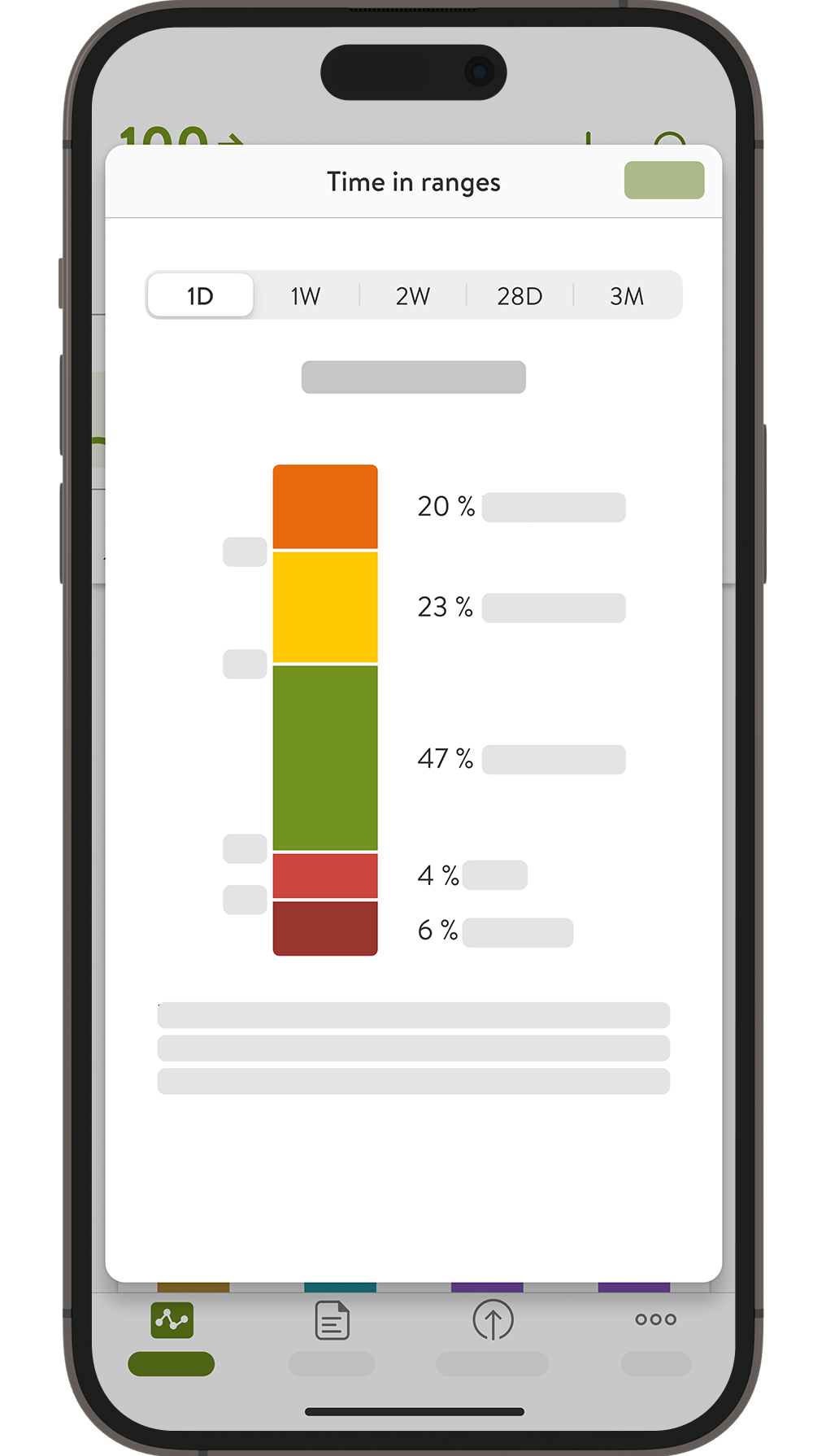
The mySugr app provides a clear summary of your diabetes data at a glance. Get an overview of your glucose curve, trends, and Time In Range (TIR) with simple graphs to help you learn more about your diabetes. Statistics like your Glucose Management Indicator (GMI) help you understand how your therapy is working.1 Tap the Graphs icon in the tab bar of the Home screen to see different types of data: